The crypto industry, as we know it, is a volatile endeavour, and having the necessary tools and indicators may be crucial to making informed and correct decisions. One such tool that has gained traction among traders is the Bitcoin Rainbow Chart. In this article, we will discover its purpose and how it can assist you in analyzing Bitcoin price trends historically.
Key Insights
- The Bitcoin Rainbow Chart visually represents Bitcoin’s price history, helping investors predict future price movements.
- The Bitcoin Rainbow Chart consists of seven colour-coded bands that represent different price ranges.
- The BTC Rainbow Chart focuses on long-term price trends and ignores daily fluctuations.
- Understanding the BTC Rainbow Chart can assist in making informed investment decisions in the market.
What is Bitcoin Rainbow Chart?

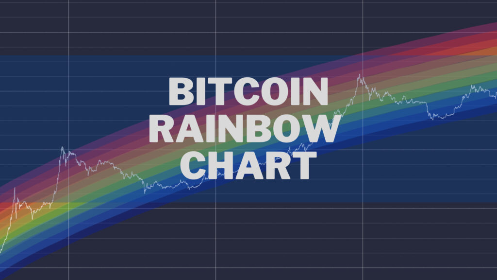
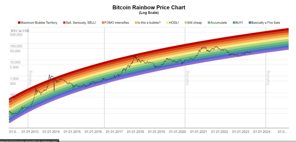
The Bitcoin Rainbow Chart visually represents Bitcoin’s price history over time, which helps investors predict its future Bitcoin price movements. Simply put, it brings in a multi-coloured representation in the form of a chart, plotting Bitcoin’s long-term price movement through a logarithmic scale. Every colour band represents a varying price range, with blue being the lowest and dark red being the highest.
When analyzing, you may discover that daily fluctuations do not allow daily fluctuations in different price ranges to throw off its data. However, the BTC Rainbow Chart ignores the noise of market movements, focusing only on the overarching market cycle.
Related Article: What is Ethereum Rainbow Chart and How To Read It in 2024?
Who Created Bitcoin Rainbow Chart?
The original Bitcoin Rainbow Chart is mainly used as an essential tool to plan long-term investments and measure market sentiment. Back in 2014, a Reddit user, Azop, formed a graph that could evaluate the Bitcoin price just for entertainment’s sake and for a few investors in the community. The graph created was rainbow-coloured, which resulted in its dubbing “Bitcoin Rainbow Chart.” The graph’s data is presented on linear and log scales.
After its inception, it became famous and spread through the community, with one user applying logarithmic regression. Later, Über Holger developed it further and published it on the Blockchain Center.
Logarithmic regression is used mainly to analyze statistical data in a nonlinear manner. It is primarily used to find relationships between factors that are not linear. The most notable characteristic in the graph is that the rate either initially decreases or increases and gradually slows over time.
You May Like: What is Dollar Milkshake Theory and How to Apply it For Your Trading?
How Do You Read a Bitcoin Rainbow Chart?
Interpreting the Bitcoin Rainbow Chart is relatively easy. The BTC Rainbow Chart consists of seven colour-coded bands, with every colour representing a specific price range. The determination of the bands is based on Bitcoin’s logarithmic price scale. The colours range from red to violet, with red being a highly overbought zone and violet being an oversold zone.
Here’s the guide to read the Bitcoin Rainbow Chart:
- Red Band (Sell!): This is the top band representing the highest price range, relating to a period of speculative euphoria.
- Orange (Fear of Missing Out): In its orange band, Bitcoin’s price is mostly in its FOMO stage, meaning it is relatively high. It also means that it could become a bubble very soon.
- Yellow (HODL!): When the price is in yellow, it often indicates that it is neither too high nor too low.
- Light Green (Still Cheap): When the price of Bitcoin is in the green, the BTC Rainbow Chart indicates that the price is trending on its low side.
- Green (Accumulate): The level also indicates that some of Bitcoin’s price is low. Since it is potentially undervalued, there is room for growth, making it reasonably an excellent time to buy, not sell.
- Blue-Green (Buy It!): The period also indicates the low price, primarily making it an excellent time to stock up.
- Indigo (Fire Sale): The price at the indigo level is as good as it gets as it is below the long-term average, which suggests oversold conditions. This introduces an attraction zone for investors who are interested in the Bitcoin market.

How do Bitcoin Rainbow Chart Work?
Most cases, Bitcoin’s price analysis occurs on a logarithmic line chart. However, the Bitcoin market generally displays the price over a specific period. The rainbow chart can assist you in changing between different time frames to understand the value of the asset on the blockchain.
Bitcoin’s price mostly displays the price difference from 1 minute to a month or several years. Most charts show the value of Bitcoin against any given currency or other asset.
Conclusion
The Bitcoin Rainbow Chart is valuable for analyzing Bitcoin’s historical price trends and predicting future movements. Primarily, it represents Bitcoin’s price range through colour-coded bands. By understanding the BTC Rainbow Chart and how to read the colours, you can gain insight into when optimal entry or exit points may arise. Ultimately, these may help you make more informed trading decisions as an investor.


![Best Crypto Exchanges for Day Trading [currentyear] - Top 6 Platforms 10 Best Crypto Exchanges For Day Trading](https://coinwire.com/wp-content/uploads/2023/10/best-crypto-exchanges-for-day-trading-1024x683.jpg)
![Best Free Crypto Sign Up Bonus Offers & Promotions in [currentyear] 11 Best Free Crypto Sign Up Bonus And Promotion](https://coinwire.com/wp-content/uploads/2023/08/free-crypto-sign-up-bonus-1024x683.jpg)
![Best Crypto Exchanges in Malaysia (Updated in [currentmonth] [currentyear]) 12 Best Crypto Exchanges In Malaysia Featured Image](https://coinwire.com/wp-content/uploads/2024/05/best-crypto-exchanges-in-malaysia-featured-image-1024x683.jpg)